Leif Norman photographer
full time arts and culture photographer in Winnipeg Manitoba Canada
Architectural Photography, a tedious discourse
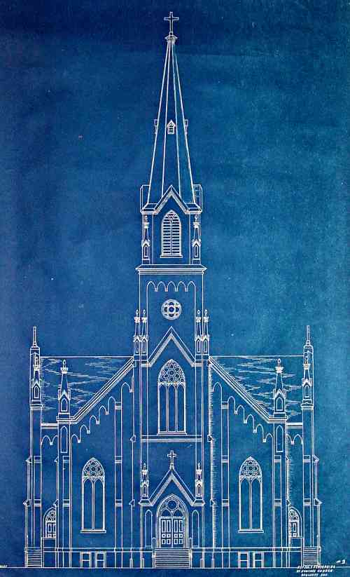
Architectural Photography
Photographing Buildings
(Making the Architect look good in a magazine)
This is a deceptively difficult area of Photography
A good photo of a building, or any subject in photography, will look like you did nothing at all.
This is the definition of cool. Low input; high output.
You just walked up and snapped the picture, right? (Cool.) But, there is a method.
The mode of Architectural Photography in the latter half of the 20th century was to show the building in an ideal way, though Julius Shulman brought a bit of style to the style.
(A Wikipedia entry says “The clarity of Julius Shulman’s work demanded that architectural photography had to be considered as an independent art form.” Is this true? In the 30’s ands 40’s Architectural Photography began to forge its own way? This might make sense as around that time Architects were starting to be seen as artists, and their buildings as Art, not just nicely functional objects.)
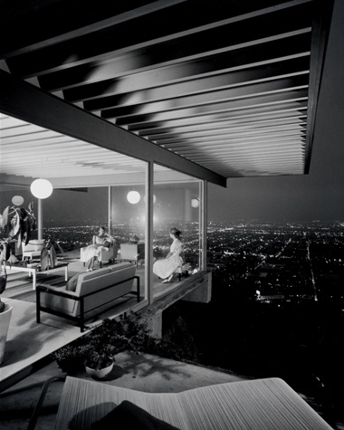
Everything possible was done to make the building look model, exemplary and pure.
Posters were removed from poles. Garbage cans and litter were moved out of shot. Cars were not allowed to obscure the building. People were carefully placed to show scale and fill areas. Graduated filters were used to darken the sky in a pleasing manner. And under no circumstances were children allowed to be seen picking their noses behind couches. The photos looked like they belonged in a textbook. Like the draughtsman just drew it there.
Adjectives to describe this late 20th century aesthetic might be; clean, geometrical, bright, technical and punchy. (See Gerry Kopelow, Henry Kalen. These are Winnipeg Architectural Photographers.)
In the early part of the 20th century architectural photography was starting to break away from an identity as a technical tool of the engineers and architects, and became more of an independent agent with a voice of it’s own.
Gritty, edgy and natural would be the other side of the late 20th Century coin. (See recent Architectural Photographers Iwan Baan, and Martin Tessler)
Contemporary Architectural photography is moving from the clean to the gritty.
Is there a reason for this?
Yes. I have a theory. And now I’m going to tell you all about it.
(This next bit gets epistemological. You have been warned.)
epistemology |iˌpistəˈmäləjē|noun Philosophy; the theory of knowledge, esp. with regard to its methods, validity, and scope. Epistemology is the investigation of what distinguishes justified belief from opinion.
At first, from 1839 to around the 1870’s, photography had not got over itself yet.
“Look! I pointed the camera at this thing and got an image! Wow!”
A photo of anything was amazing. A house, a tree, a blurry image of your sister…
Then, crucial decisions about how to frame the shot, where to plunk the camera down, and a realization of how the focal length of the lens affected the image, began to creep in along with conversations about what Photography was for, and what it could do.
At first people talked about the bare bones of technique and recipes and lens designs, and then some conceptual ideas about the methods.
And then, people began to talk about the philosophy of the thing.
This is usually what happens when new sciences and technologies appear. First they show up, then they grow up.
When photography began to get its intellectual feet under itself, then the philosophy and mindful energy could turn back and describe how to use the techniques in specific ways.
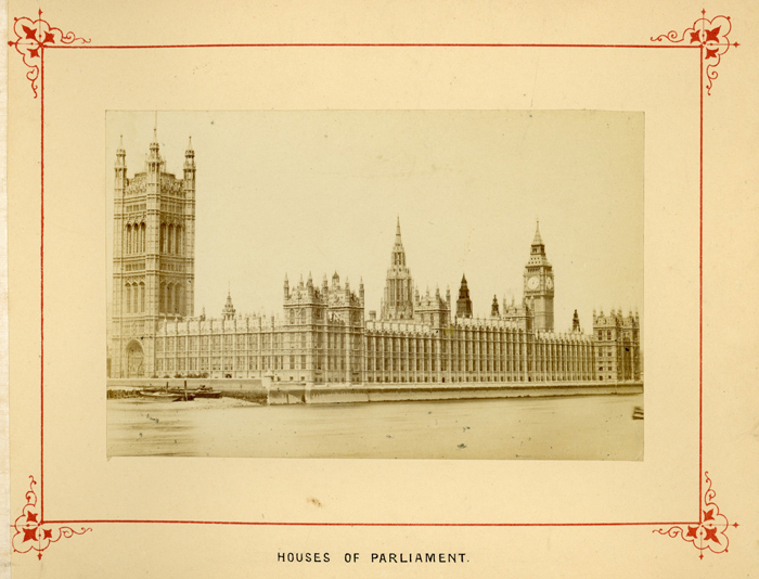
At first the mere act of executing the chemical recipe was like alchemy. Even a poor result was a miracle. Once the first stumbling steps were worked through then discussions about technique could show up and begin to inform the usage of the techniques.
These discussions changed photography and then photography found the world changing before its eyes. The first photos of streets and people and things were not just functional and illustrative, they contained more than just what existed in the daylight hours. They could be thoughts unto themselves used to convey messages of higher order complexities; not just “Look at This.” but “Look here, and think what I am thinking. Feel what I feel”.
So the buildings of the past (see Atget) and the buildings of the present gained a voice.
Architectural photography just barley started to become metaphorical. And interesting.
From the beginning, in all types of photographic genres, large format cameras were used.
This is a daft statement because large format cameras were all they had to use. Duh!
(In World War One the Air Force used bi and tri-planes powered by propellers because that is what they had. A style of fighting emerged. There were no Jet engines and delta winged fighters; so there were different techniques used in dog fights.)
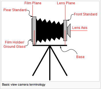
This has to be stated because the large format cameras were capable of image manipulation in a way that would seem startling to us today. The ubiquitous 35mm cameras and digital point and shoots are quadriplegic in comparison. Large format cameras could bend and shape focal planes, and change the look of the geometry of the buildings.
Once again, from Wikipedia http://en.wikipedia.org/wiki/View_camera here is an explanation of View Camera movements.
The power of the large format cameras was turned towards the grand old European buildings and the newer Victorian edifices that were being built. And this power controlled how the buildings looked when seen through the camera.
This was because there was a desire to idealize the lines of a building. In other words people liked the vertical parallel lines seen on the blueprints and so they attempted to recreate them in the photos.
But, what man sees and what man gets are two different things.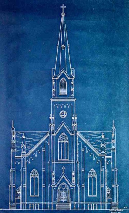
Architects often imposed their visions upon the landscape in a brutal and brazen manner, and so the photographs had to conform to the idea of the design rather than the reality of the landscape in a similar way.
For example, when a person looks at a building in the real world the bottom will be larger than the top. The perfectly rendered square or rectangular front of a building becomes a trapezoid. So a lot of talk was made about how a photographer must use the large format camera with full tilt, shift and swing movements, in order to correct for such perspectives and carefully control what will and won’t be in focus. (And it was all in focus. f 64 seemed to be used permanently.)
Because the perspective controls of the camera were so useful and powerful they became overly significant in the repertoire of a professional photographer. The controlling of lines and angles became the ultimate goal for architectural photography and proof of the competence of a photographer.
The ends eclipsed the means.
In other words the tricky and clever goal of straightening and idealizing the image of building was seen as such an achievement that the means of taking the picture became entrenched and therefore stultified. The technique was more important than the style or vision.
stultify |ˈstəltəˌfī|verb ( stultifies, stultifying, stultified ) [ with obj. ]1 (usu. as adj. stultifying) cause to lose enthusiasm and initiative, esp. as a result of a tedious or restrictive routine
As shortsighted humans usually do, they regard something as important only when it becomes easier to accomplish. Going to the Moon in 1921 was rather irrelevant and unimportant only because it was seen as nigh impossible. Going to the moon in 1960 became quite relevant. Why? Because it was within our grasp.
Photography and all other technical exploits run similar courses. Shooting a building in “non-ideal” ways above was less important in the film era and more important in the digital era simply because the possibility of doing so changed over time.
We do what we can do, and it seems that the whole world is wrapped in limited possibilities, but only after seeing them in the rear view mirror. “It’s all relative” seems trite, but it’s achingly true. In the future when the teenagers are Jet Packing to the Moon Mall, fine distinctions between the cool new eyeball implants will be made. But for us in the past it all seems like sweeping nonsense statements. Early pundits thought the telephone and computer would be limited to a few per city. Who would want one in each home? That’s crazy!
And so we find contemporary Architectural Photography becoming less concerned with “converging verticals” and fine control of colour temperature with an array of expensive filters, and more concerned with everything else.
In the 1930′s a commercial photographer concerned with duplicating a painting was very concerned with using the right yellow filter. Why? Because the black and white Orthochromatic film rendered colours only in light and dark grey. The Yellow and Amber filters allowed the textures of reds and orange paint to be seen instead of showing up as featureless black. So choosing the right filter was where all the expertise and technology dwelled.
In a land where no bricks and stones are available, sod huts become the height of engineering and design.
(I’m getting into the weeds of this argument and belabouring the point a bit.)
The Crux; technology often dictates what gets done with it instead of the other way around.
You would think that the creative eye of the photographer would be master in this game, but sadly no. The tools told the craftsman what to make. Why? Because the craftsman only educated himself up to the level of “minimal professional” and then stayed there. He followed the path of least resistance and used the intimidation of expensive and complicated gear, and the little knowledge he had, as a magical hat, to ward off any challenges to his authority.
I have seen first hand how “professionals” in an area will use pseudo authority (“I have a degree!” “This is the best company in the country!”) to intimidate you into obeisance when challenged. I have also seen similar people use jargon and tech speak to exclude others.
A common technique to cover up a crashing lack of actual skills is to focus on a very specific aspect of the thing they are already supposed to be an expert in. To bluff their way through they will go on and on about how the Wang Doodles and Smizmars must be JUST SO, while ignoring the fact that the topic contains dozens and dozens of things which are equally important and arcane. To an outside eye they are an “expert”. Even though the outside eye has no idea what a Wang Doodle is, or how important it is in relation to the whole subject. This is like caring very deeply about the colour of the car that won the race, while ignoring the driver, the engine, and all the other cars.
This rant about false professionals must be addressed because this phenomena is what holds fields of expertise back. And as we are talking about the evolution of style and technique in a specific field, I find it pertinent.
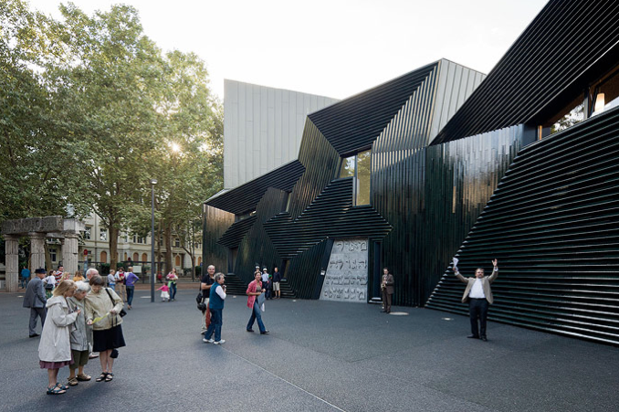
What could be done if pushing the aesthetic forward was ignored in favor of what should be done according to entrenched ideas?
Such as it goes. People choose to not make a dent in the universe.
Two modern things that seem to be one in the same are actually separate, and responsible for a shift in tastes in all photography; Digital Imaging and Photoshop.
The fact that we can make endless images at no cost allows us to become extravagant and indulgent in our picture taking whims. Film was finite and forced us to consider each click. Digital allows us to be messy, inconsiderate and wasteful while at the same time allowing the pensive and protracted photographer to take his time and only take one careful digital image, if he chooses.
We forget, in the days before Photoshop, the camera was king. Any post processing of the image was expensive and time consuming and so avoided if possible. By today’s standards this seems a bit dull and devoid of oxygen. Digital has given us the freedom to mess around a bit.
Photoshop and other “Computer Programs” as they would call them in the 80′s, allow us to manipulate images to such a degree that reality can become fantasy in a matter of minutes. Day can become night. Colour becomes Black and White. Curved lines become straight. Pimples disappear and smooth skin becomes an actuality. This power allows editors and photographers to make an average photo look zingy.
These two things give breathing space to photographers in all respects. Wedding photos are not as posed and stilted looking as they used to. Action and adventure can be captured easily. Something as ponderous and time consuming as photographing a building can be experimented with.
But what would actually be in a newer style photo now that the digital photoshop genie is out of the bottle?
Regarding a building in the full context of it’s surroundings; showing abandoned lots around it, showing older buildings around it, seeing congested infrastructure in the forms of overhead wires and cables, whether the building fits into the neighbourhood coherently or clashes (purposely or by accident).
Showing people interacting with the building; opening doors, looking out of windows, actually existing in the space instead of being warm mannequins only there to show scale.
How about something crazy like?: Displaying a building through the day or seasons; allowing the light of the sky to mingle with the light of the building. How about embracing the freedom of digital to let you have the time and energy to do this at all? Showing the building in a non ideal light. Breaking the rules and the growing accustomed to the new look. (E.g. Cubism. Punk rock. )
These are all things which were less likely to occur in the film era and more likely to occur in the digital era.
Architectural photography has moved on into new, and we hope, better areas.
Here are some concepts I have discovered or invented or stole:
Shoot the building as it is, not as it should be. Don’t try to be tricky and make it something it isn’t. (Example: over polished overposed over lit bogus trite 80’s fashion photography.) Sadly, if a building is dull and badly designed, one might have to get all fancy and start using photographic angles and cropping and such. But this will probably end up with photos that speak louder than the building. The architect should be the star, not the photographer.
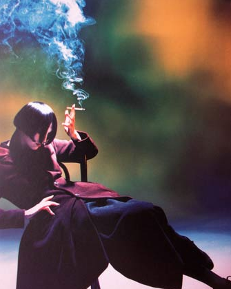
Notice lines and angles. Are there curves? If the room is huge then try to make an image that gives that feeling. Do curves mesmerize and play across a flat field? Then show it. It’s stupid to go on like this but it needs to be said. If the building is all about the lack of detail and the colour of the smooth minimal walls, then make sure the photos show that. Don’t make a photo that has shadows jumping all over those smooth minimal walls; allow the emptiness to speak. This is where cloudy diffused light can be used instead of bright sunny light. If the top of the building is heavy but looks eerily suspended by a transparent base, then show it. The bleeding obvious is sometimes hidden.
Allow the light of the day to tell the story too. Architecture is a slow art form that resides in decades, so the photography of this art is slow as well. The optimum picture might be 6 months away, in winter. You might have to wait until it rains. Or until it is overcast at 9pm. Try to plan ahead.
The placement of the camera can be in terms of hundreds of feet away from the building where 20 feet to the left or right makes no difference, or a slight adjustment of one inch up or down will create or obscure a harmony of lines in a stairway combining with a window feature. The problem is trying to be aware of the minute and the grand all at the same time.
A series of photos will tell the story of the building. Allow yourself space to let each picture connect to another and show facets of the structure. In 8 or 10 images one should be able to feel they have visited the building without ever having been near it. Choose one window carefully, for example, and then set up a shot looking out and one looking in. The viewer should be able to start seeing the building in three dimensions in their minds. They will start to imagine walking up those stairs, and then down the hall, and then out that door into that courtyard; if the photos have spoken properly to the viewer.
Each photo of an aspect of a building, inside and out, might bring to mind an adjective that says something about the building. Strong. Futuristic. Simple. Grand. Delicate. Plain. Exciting. Now stand back and ask yourself, is this really what should be used to describe the place? Does that word belong in the vocabulary of the building? If not then discard the photo or go back and retake that photo in such a way that tells an accurate story.
The goal is to balance the artistry and cleverness of the photographer with the honesty and reality of the building. The architect speaks in steel, glass and stone to create moods but also to make a useful practical environment. So he too is forced to walk a line between two worlds.
When moving around or within a building be mindful of spots you have not stepped in. While walking back and forth in the parking lot outside, trying to get the lines and shapes to come together, take the shot you just set up, but then go to a spot that you have not stood in yet. It might work. You might see something new. Just turn off your head and go to the ignored spot, the corner of the room that for some reason has been neglected. Look at the area like a chess board. Is there a square you have not stood in yet? Or perhaps a better analogy is Battleship. You are trying to find something even though it might not be there. Try J 10. You might hit something.
“Don’t think, look!” – Ludwig Wittgenstein
“Good Architecture is like a piece of beautifully composed music…” – Tao Ho (b.1936)
“In Architecture the pride of man, his triumph over gravitation, his will to power, assumes a visible form.” – Friedrich Nietzsche (1844-1900)
“Architects know nothing, and I don’t want them to show me the house. I want to show them how their house looks.” – Julius Shulman (1910-2009)
“Julius (Shulman) has a kind of special pattern of how he works with houses. His pattern of photographing a house is telling the story of the house. So, for example, you’d come up the driveway, and Julius would say: ‘Stop the car. We should do the first photo from here.’ So we’d photograph the house from the driveway. And the next photograph would be the front door as you are looking into the house, so you get a feeling of where you are. Then maybe you’d have this red vase in the corner of the photograph and then, in the next one, it’s in the center of the photo. Always some object is guiding you, bringing you from one photo to the other. This is very Julius Shulman. He always wanted to show houses in a way that you didn’t need floor plans.” Juergen Nogai
“The photographer looks at the house in a completely different way than the architect who created it. The architect [might have been] struggling with a corner, maybe some stabilizing problem, and he wants to show how he solved it. But that doesn’t interest the viewer, necessarily. The photographer is telling the story of the house, not of these architectural problems.” Jeurgen Nogai
This next bit is about the difference between a bunch of data and actual knowledge. People are easily confused with facts and true wisdom, but they still get degrees anyway.
There might exist something called the Opera Principle. What is impressive is difficult and what is difficult is impressive. (Any average human tromping across a stage and doing a few spins is not ballet.) A conclusion of this principle might be; being taken seriously as a photographer merely by buying a bunch of expensive equipment. Ooh. Impressive!
If a photographer, engineer, or designer is still stuck in the wide eyed revelation phase of education, they will drone on and on about how:
“you must understand the relationship between form and function”
“we have to be creative”
“challenges must be overcome with careful technique”
“understand where the inspiration is coming from”
“you must know how to construct the image”
“don’t try to overcomplicate things”
“try to have passion and understanding for the subject”
Vague and meaningless statements such as these are a screaming indication that the writer has no idea what they are doing in the practical field.
There is no concrete knowledge here. One might as well say: “Make it good.”
Unless they actually come out and say some thing incisive in a book about the subject, it is a waste of time. Maybe they don’t want to give away any secrets. Maybe they don’t know anything in the first place. It is amazing how a publisher will create a 200 page book with one page of good information in it.
afflatus |əˈflātəs| noun a divine creative impulse or inspiration
When a person first starts to crack into a new field of knowledge and action (how to do the thing) there is an afflatus, a rush of energy where anything seems possible. Sweeping platitudes spring from this inspiration and you feel wise beyond belief. Like dipping a toe into the hot bath of wisdom it can seem too much to take and beguiling all at once.
Eventually one should climb in fully and get accustomed to the heat and relax into the body of knowledge. But so many people stop at the beginning, their ankles barely wet, and muse and wax poetic about how much they know, lest it overwhelm them. A little knowledge is a dangerous thing yes? They are still at the effect of it, instead of getting involved with it, owning it, exploring it and finally being able to control it, instead it controlling them.
At first in one’s studies, one can feel the data and knowledge push against them like a weight and they feel small minded and insignificant with it. But if they persevere and continue to work with it they will find they can push back and eventually handle it so well they could juggle it like a ball and make it do new things.
Many people are stuck at the point where they are barely cause over it and because they do not fully understand, they use it in a rote manner. The knowledge is still pushing them around.
In the mind of an amateur there are many choices. In the mind of a master, there are few.
Fantastic!