What to wear for an actor’s headshot:
Don’t worry about carefully choosing pants and shoes. The camera is looking at your top half; it won’t be looking below the belt much.
Update! As of 2021 Casting Directors are looking for full length body shots, so brings something casual for your bottom half. …and don’t bring sandals or Crocs!
Wear something comfortable, and something you actually like to wear; then you will appear calm and natural.
(Full length body “headshots” were in vogue in the 1990’s, but have not been requested lately.)
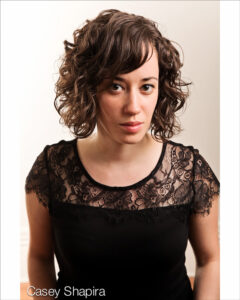 Women should not wear anything too low cut and revealing. Bring five or so of your favourite tops that don’t have loud or distracting patterns. Bring different colours; warm, cool, dark, light. Once we get into the studio and under the lights it will become apparent what works and what does not.
Necklaces and earrings are good if not too big and jangly. Hair should be trimmed at the salon a day or so before the shoot, or possibly the morning of.
Makeup should be kept to a minimum; less is more. A bit of eye liner, blush and lip gloss. Simple.
People can usually apply their own so a make up person is not needed, though I do know some in Winnipeg who can come by during the session if you wish.
Get a good sleep the night before and drink lots of water to make your skin look fresher.
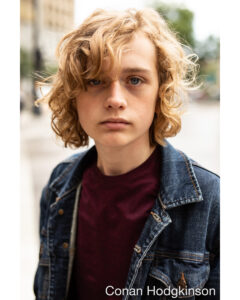 Men should heed all advice given above, (but could probably ignore the low cut revealing bit.)
Bring some casual and also some dressy stuff. That means t shirts, and button up shirts and possibly suit jackets, but not usually ties unless we are going for a business shot. Ties usually make you look like a lawyer or a real estate salesman, not an actor.
Shirts with solid colours and thin stripes look good. Nothing with huge prints or TapOut written on the front please.
Bring something you actually like being seen in. If you feel comfortable and confident then it will make for better photos.
Men’s hair is easier to deal with than Women’s hair, so get a trim a few days before the shoot and bring a brush. Easy.
Also; make sure you shave carefully. Those little whiskers show up!
What to wear for a business portrait:
Bring your favourite suit, shirt and tie. Colours are good, depending on how reserved or bold you want to look.
With business shots there does not need to be as much trying on of different tops and coloured shirts, so it should be quick and easy.
Bring another tie or different earrings for a choice of looks.
These shots are fairly conservative so they will take less than half an hour since we are only going for a clean nice looking shot of you, and not scratching our chins about which tiny turn of the head, or what the tweak of an eyebrow means, as with actors headshots.
Where to take 8×10 files to be printed out:
(I supply 400 dpi 8×10 jpg files)
Actors are actors,
and technical people are
Directors, Lighting Designers, Stage Managers
and all the rest of the people you don’t normally see
on the covers of magazines.
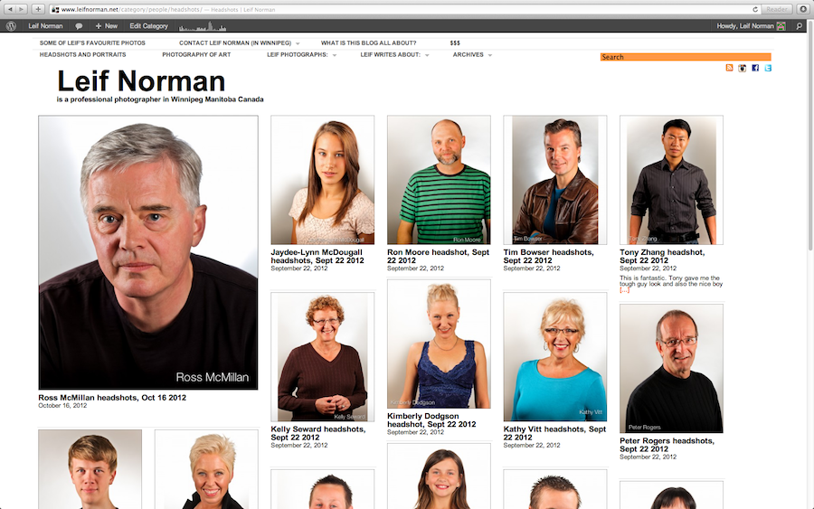
Leif Norman has photographed over 130 headshots for actors young and old in Winnipeg. Click on image to see the Headshot gallery.
All professionals need a proper photo of themselves,
…but there is a matter of style.
There is a difference between a portrait and a headshot.
A portrait can be any nice picture of someone
but a headshot has some rules.
Beware of the photographer who calls a portrait a headshot!
This article is an attempt to describe the differences
between types of headshots for actors
and portraits for everyone else.
If you disagree or want to comment then please talk to me at
Leif.Norman@gmail.com
Communication is the soul of art.
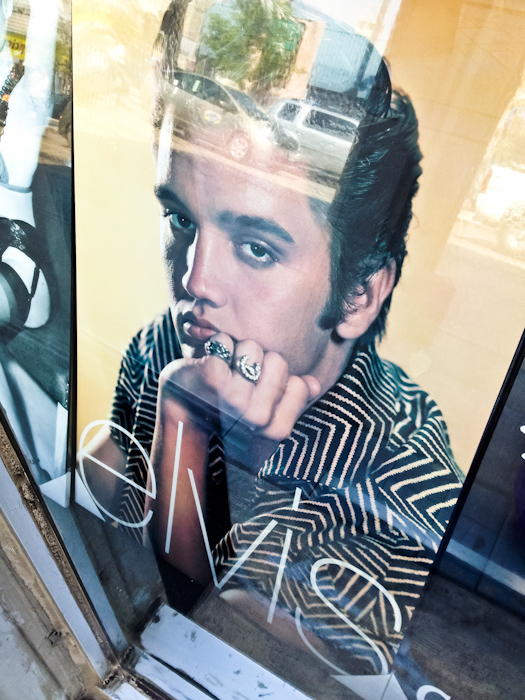
This photo poster of Elvis I shot through a window is a portrait and not a headshot. Why is it not a headshot? He looks totally bored. The shirt has a really distracting pattern. His rings are stealing attention from his eyes, which is where we should be looking, and the lighting on the right side of his face is far too bright and hard. It’s a great portrait of Elvis looking bored though…
An actor wanting to do extra and background movie work (BG as they say) or going for a leading role needs a different shot than a theatre director, or a stand up comic.
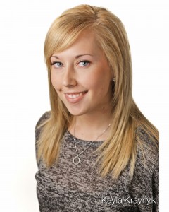
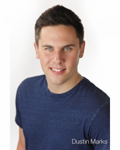
The BG person, or any actor trying to get television and movie work, will need a nice bright clean energetic 8×10 that does not cut off the top of their head, preferably shows their teeth, or lack of teeth, and is cropped to show some torso so the casting director can get a sense of their size.
Fancy hair styles and make up should be kept to a minimum. Less is more in this case. The headshot has to be direct and free of any distractions such as awkward poses, hands, props, or fancy locations such as inside cars, in back alleys or near elevator shafts. Photography like this tends to flatter and butter up the person in the picture, and puff up the photographer too! Putting parsley and shaved oranges and sprinkles and radish roses with oregano espagnole drizzle all over the plate might make the food look more interesting, but it doesn’t make the meal taste any better.
Headshots have to be in colour. Black and white is mostly a theatre thing; not movies or TV. Almost every headshot these days is in colour.
The orientation should be portrait and probably not landscape. (Portrait is: 8 inches wide and 10 inches tall. Landscape is 10 inches wide and 8 inches tall) This is what I have learned from casting directors and theatre directors in Winnipeg Manitoba Canada. It may be different elsewhere.
If the actor is more established in the movie or theatre scene then they could get away with something different. They might not have to show their hairline, like in the Hurley photos below, and they might also want a more interesting background than just pure white or grey or black. They don’t have to be introduced nearly as hard as a beginner does, and so they can simply show their face and the director will go “Oh yes. Her. I know about her.”
The newbie, whether they are going for non speaking extra work, or aspire to be a leading lady in a full length feature, has to present themselves as fully and simply as possible without any risk of the director dismissing them out of hand for some foible in the photo. Play it safer first, then you can mess around once they know you.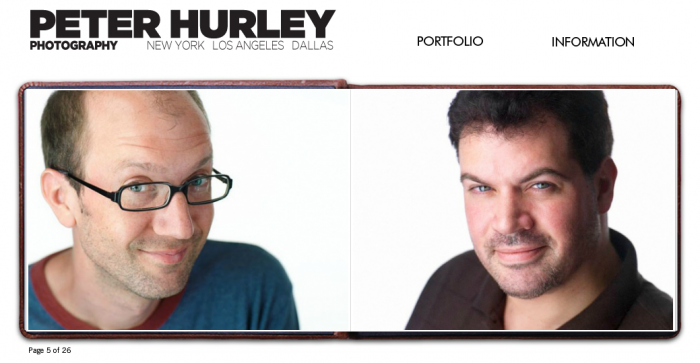
Peter Hurley (amazing headshot photographer) takes landscape style shots instead of vertical portrait shots, because he says that is the way we see movies and the world. Our eyes are placed horizontally not vertically, so Peter says it is more natural to see the image horizontally. I agree, but also disagree. Casting directors looking at people they have never met want to get a sense of the size of the person. The vertical portrait orientation of the image allows the person to be seen better. I take headshots in the vertical style but would gladly make them in any manner if I thought it would help get the actor hired.
To get the info across as quickly and clearly as possible one should shoot the person vertically. If you want more style and can get away with more pizazz or don’t need to “sell” the person as hard (like Jim Carey or Connie Nielsen) then you can shoot them horizontally or square or whatever. There is a reason Passport pics are vertical.
Information.
Quickly.
In fact most people going for any job with camera work (commercials, sit coms, movies) will want to be a bit conservative. Mind you, it’s all well and good to have a bit of pizazz and personal personality show through, but in today’s hyper sensitive image literate society, a little snazz goes a long way, and can turn the viewer off. They only want to see what you look like. They don’t want to be seduced by you.
The lighting should not upstage the person or be too edgy or dramatic. That is; there should not be dark shadows or super bright spots or anything where the person looks consciously and deliberately “lit” in a style. The lighting should support the person in the shot and not steal focus. The photo of Alyssa below has a very dark shadow on one eye and a yellow gel coming in from the side. Very striking, and pretty cool for a fashion shoot, but too much snazz for a straight up headshot.
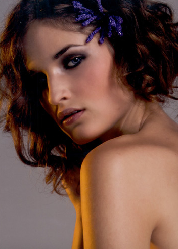
Alyssa K from Panache Management, Winnipeg. Photographer unknown. (This model photo was chosen because it was the first example of fancy lighting I could find. I am not implying anything is “wrong” with this agency, model, or photographer by referencing it in this article. This is an example of model photography to compare to “headshot” photography.)
Women will have to be mindful of plunging necklines. Showing too much cleavage and décolletage is a bit tacky, distracting, and makes it look like the person is a bit too, umm… eager to please. Men should probably not have Santa Claus style beards unless that’s “your thing”.
If they want you to have a beard or show off your boobies, then the wardrobe and make up department will take care of that, once you get hired (!), so you don’t have to worry about showing them off in the headshot.
The clothing and jewelry should not be too flashy and the photo should not look like the person is in an advertisement for the jacket they are wearing or the hairstyle on their head. I have seen many “headshots” where the person looks like a model in a fashion magazine. Slightly exotic location and background, pouty lips, flashy lighting, aspirational clothing, etc…
It inflates the ego, of both the actor and the photographer, but one should remember we are trying to communicate truthfully about the person to the casting director, not present an edgy “look” and lighting style to puff the person up. The face and eyes and connection of the personality is more important than the lighting, fashion and location. Not the other way around.
An established theatre director, who does not need to worry about breaking into the scene, can get away with a bit more flair.
Darker shadows for a more dramatic mood.
Props, hands and interesting lighting can be used.
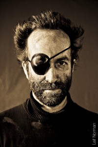
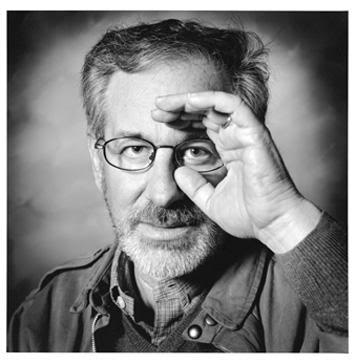
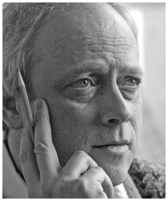
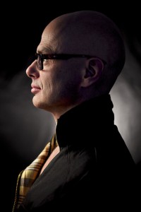
It could be in black and white. In fact it probably will be. They could have almost any expression that works for them, and they don’t even have to look at the camera! This style would be more of a portrait and less of a headshot. (See the pictures of the two Stevens)
A technician like a lighting designer, stage manager, sound designer, set designer or choreographer can also get away with a lot more style and less vanilla structure. The message of these images is not “Look how clean and clear I am presented. I am confident and approachable. Cast me!” as an actor would say. The message is “Here I am looking cool doing my job. I don’t need your approval.” Because, guess what, they already have been hired and probably have three gigs waiting ahead of them.
They could be in an interesting location, preferably in their element at the theatre. The woodshop, the mixing board, cutting fabric. This type of photo is not trying to sell the personality and energy of the person; they are not trying to get hired. All they need is a good representation of themselves looking like they are competent.
A general theatre headshot for an actor should be like the movie BG shot described above, but can have more mood. (In this case mood means a darker background and Rembrandt lighting, or a busier background, or something like that.) They don’t have to be grinning and energetic but they still have to look confident and approachable. The top of their hairline could be cropped off like in the Hurley shots above. Some different locations and backgrounds can be used, but be careful not to let them upstage the person. They are still the focus and the shot has to let them speak clearly to the viewer. Black and white still seems to be a la mode for theatre people but here and there you see some colour 8×10’s pop up on lobby call boards.
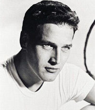
The movie headshot is trying to show a clean blank slate (tabula rasa); the theatre headshot can show a bit of character and verve and edge. I have even seen a few stage actor headshots where they are not looking at the camera like in the Paul Newman shot above. It’s not common, but it could work.
Both the Movie and Theatre headshot should not have the person looking tough or mean or overly excited, or some other character implication. It makes the actor look like they are desperately trying to play the role even before they get the part. Do they only want to be cast in specific roles? The criminal? The angry brother? The goofball? That is the casting director’s job, not the actor’s and certainly not the job of the photographer.
If the actor looks zany or silly or angry or tough or super sexy,
then it is not a HEADSHOT,
it is a PORTRAIT of a person pretending to be someone else.
The expression for any headshot should be subtle, positive, and open and make the viewer look like they have already met the person in the shot, even though they never have. There should be a real connection through the eyes where you can feel the energy of the person. Never be satisfied with a headshot where the person looks vacant or bored. It has to sizzle and zing for camera work and it has to be solid and potent for theatre work. Beware of the dead eyed look when people are smiling with their mouth, but not with their eyes. The job of the photographer is to bring a genuine moment out of the person and be adept enough to capture it.
“What I aim for is a naturalness — you see it in the eyes. We look at the eyes when we first see a photo; if the eyes are dead, it’s a dead image.
You’re looking for that spark that makes you wonder, ‘what are they thinking about?’ Everything is very subtle.“
– Francis Hills
Nice lights and lenses and clothes are important, but not as important as good communication.
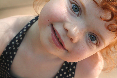
Above all else, the real person who walks into the audition room should be the real person in the 8 by 10, not a caricature of them. The person in the photo has to look like the real McCoy. Freckles and all.

Portrait Professional, digital cosmetic surgery with a bored looking girl who has pouty lips. (Deckard: “She’s a replicant, isn’t she?” Tyrell: “I’m impressed. How many questions does it usually take to spot them?”)
(By the way my rule for Photoshopping a headshot is to Zhooj it up a bit with some added definition and lint removal and flyaway hair trimming, and to “Leave the dimples, but remove the pimples”.
I don’t think one should digitally over smooth skin, change eye colour, remove wrinkles or any other Photoshop cosmetic surgery silliness. Portrait Professional, extreme makeover software, is great for brides and models, but should never be used on actors. Doing digital nose jobs, morphing cheekbones, thinning faces, erasing pores, changing eye shapes and adding tans are neat tricks, but you end up with someone who was never there. They don’t exist.)
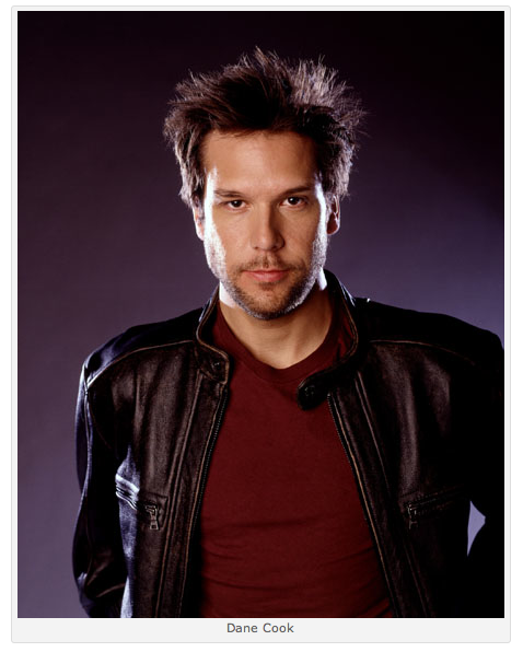
There are many different modes of performer headshot. A stand up comic can look goofy and have a mic in the shot or be winking or something. That makes sense. The person looking at the picture already understands the role the performer plays, so the shot can have adventurous variables. This image of Dane Cook on the right makes him look like a tough guy, which is fine because nobody is going to mistake him for a sports star or a dramatic actor, so the shot is half cool and half sarcastic. He doesn’t need an introduction and he doesn’t need to play it safe and down the middle. (By the way, the “Sports Illustrated” style of macho lighting used in the Dane shot was over done. His cheekbones are overexposed and blown out. Fail.)
On the other end of the spectrum from the “real” headshots are glamour portraits. Anything goes for this stuff. Over the top (interesting, adventurous, stylish) make up, hair, lighting, poses, props and wind machines can all be used. See the Alyssa Shot above. The model does not have to make any genuine connection with the viewer other than looking “good”. The default facial expression seems to be a pout with lips slightly parted and a fifty yard stare.
The focus of the photo is ironically everything but the person itself. The model is selling the watch, the corset, the luggage, the shoes, the Ferrari, the eyelashes, the make up, even the cheekbones, but not actually herself and her personality. Digital cosmetic surgery is fine in this area.
Photographer Chris Frampton has an excellent article about actors and photographers and agents. Hilarious! A must read for any headshot seeker.
Example:
“My agent is a out-of-touch dinosaur who thinks this whole “color photography” thing is a passing fad and longs for a return to black turtlenecks and chins-on-fists. Will he/she like your pictures?”
http://chrisframptonactors.com/advice/the-actors-headshot-fuq-frequently-unasked-questions/
Every person has a different story, and each photo can tell it in a different way, but more importantly the photographer needs to know how to tell it to specific audiences.
I hope after reading all this it is a little clearer about what one needs when it comes to headshots or portraits. Within the world of headshots there are a few different looks, and a portrait can be just about anything. Once you start looking at photos of people in magazines, billboards, and everywhere on the net, it should become apparent what style is being used, and whether it is appropriate or not.
Leif Norman
Click on one of the three images to
see some examples.
Remember;
Portraits can be daring and a bit wild.
Headshots need to be a little safe and down the middle.


JR Photo
Nice article about portraits and headshots, thanks 🙂
Leif Norman
Thanks!