OK, so what is all this?
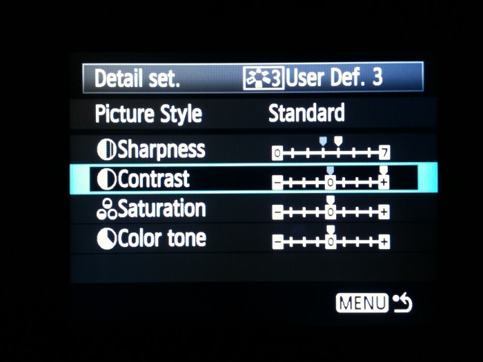
This is a study of contrast in colour of greyscale tiles in a Canon 5D mark ll.
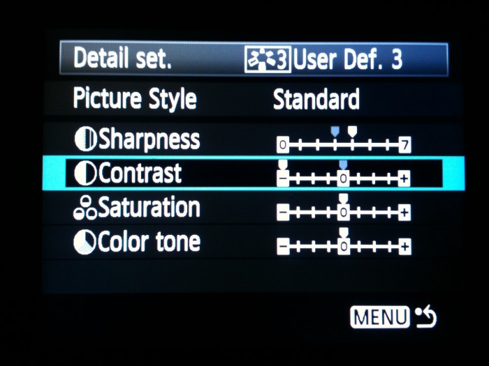
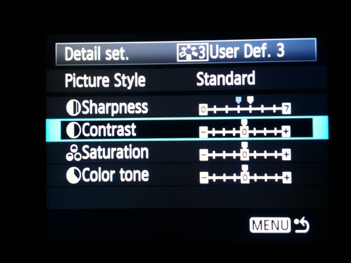
How much does the contrast setting in the Picture Style menu affect the contrast of jpgs, really?
For those who may not want to read the entirety of this rumple, here are the results:
Highest Contrast: 6.7 stops
Middle Contrast: 7.5 stops
Lowest Contrast: 8.8 stops
If you are still interested to see how we got these numbers then read on;
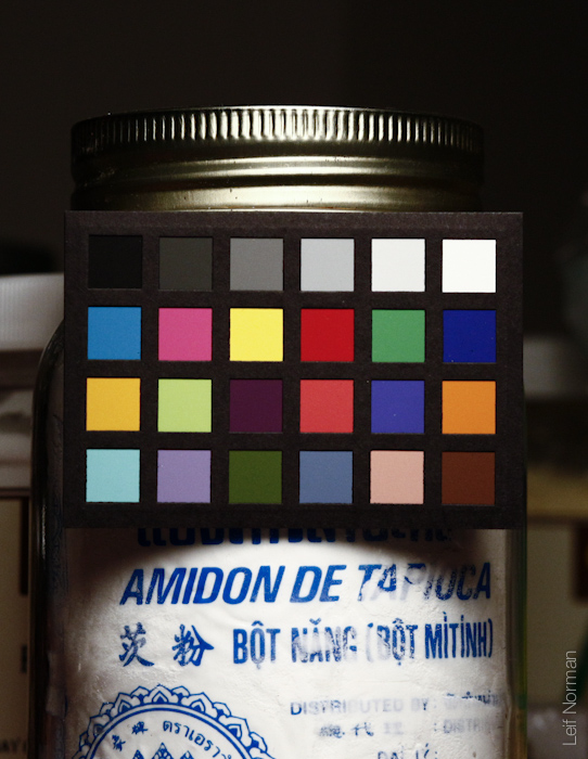
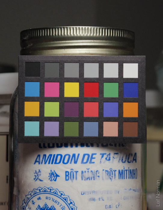
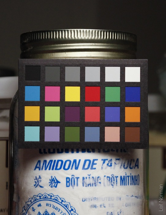
We used the Munsell x-rite ColorChecker, the industry standard so I’m told!
(I have always known it as the “MacBeth Color Checker” but I guess the company got bought or changed the name.)
The Checker is helpful in measuring colour accuracy as well as contrast and white balance.
We care about this because contrast and dynamic range are related.
One could say that less contrast equals more dynamic range, and vice versa.
from Wikipedia:
“Photographers use “dynamic range” for the luminance range of a scene being photographed, or the limits of luminance range that a given digital camera or film can capture, [23] or the opacity range of developed film images, or the reflectance range of images on photographic papers.”
The bottom row of black to white squares will help us illustrate the concept.
Let’s do a photographic experiment!
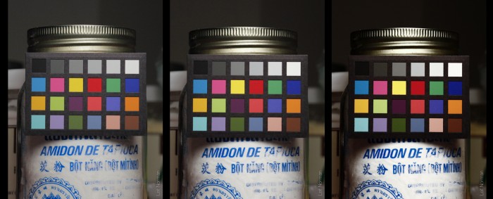
All other things remaining equal; lighting, camera position, lens, shutter speed and aperture, we photographed the colour checker and only changed the contrast settings in the camera.
From lowest to middle to the highest.
The jpg files were imported into the world famous Photoshop and the six white to grey to black squares were inspected and their RGB values were noted.
By the way, in computer colour land 0,0,0 is pure black
255,255,255 is pure white
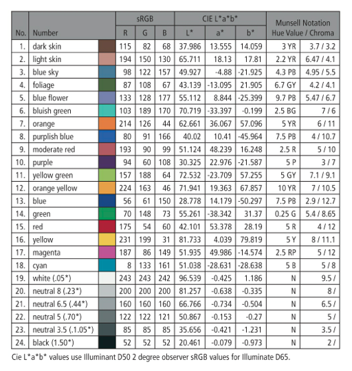
light grey is 200,200,200
255,0,0 is pure red
and 194,150,130 is sort of a skin tone.
The three numbers in order represent red, green and blue quantities on a scale from 0 to 255.
The combinations of the three red, green, blue channels can make any colour we wish.
Even shmurple.
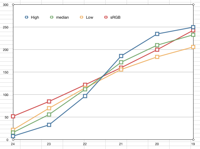
“Graph 1” High, Mid and Low contrast settings for the Canon 5D mark ll compared to Colour checker response
High Contrast is Blue Medium contrast is Green Low Contrast is Yellow
If we make a graph of the results then it looks like this. (I like graphing results! I do it any chance I get!)
On the left side of “Graph 1” is the 0 to 255 scale of what Photoshop told us the value of the square was. (Science people!) The vertical axis is called the Y axis.
Black (0) being at the bottom.
White (255) at the top.
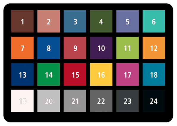
The bottom horizontal line on the graph(the X axis) is the number of the Munsell square; #24 is black and #19 is white, so looking at the graph from the left to the right we go from black through grey to white.
(see colour checker image above)
The red line is the sRGB ideal values of the ColourChecker that we got from the info sheet above. As you can see it is a straight line.
The yellow line is the low contrast response of the Canon 5D mark ll. As you can see Timmy (my lab assistant is named Timmy) the camera gives us darker blacks than what the colour checker would imply we should get, and the white is not as quite as bright. The line also arcs slightly like a rainbow but more flattened out. But it is still fairly linear in response.
The green line is the middle setting on the contrast in the camera. It starts to bend like an S. Dipping down into the darks and up into the brights beginning darker and ending brighter. Wow that sentence was tedious. The response is no longer flat. The camera is starting to exaggerate how dark the darks are, and how bright the brights are.
The blue line is the highest contrast setting. As you can see Timmy, it starts at almost complete black. Everything darker than the middle 125ish is “too” dark and then all the brights are quite bright. At the cost of accuracy the camera is pushing the response into more extreme territory. What should be dark grey is black. What should be a very bright white (but still faintly grey) has become nearly a blown out total white.
Here are the actual values we measured in Photoshop.
(Since 200,200,200 is grey, I abbreviated the values to say just 200)
So what did we learn?
Well Timmy, to maximize our dynamic range and not blow out any highlights or clip and dark dark areas, when shooting jpg, we should always put the contrast to the lowest setting in the camera and then deal with the resulting file in Photoshop or Aperture or Lightroom to make it look as contrasty as we want. Purists will shoot RAW files and deal with the images one at a time later on in post processing. But for now we are talking about jpeg files. (RAW files will supposedly display more dynamic range, and this should be an experiment for later.)
If the darks are too dark and the lights are too bright it will be outside of the 0 to 255 range and the data will be lost. Bam. Gone. Once the part of the scene we are photographing hits 255 (or even 253) the data is pretty much unrecoverable. The same goes for the blacks. Once the camera can only see 0,0,0 then it will only say “pure black” even though our eyes might be able to see something in that area. The camera will report “no data” even though there may be data there. This is bad. Ideally what we would want is for the camera to reproduce what our eye sees. We would want the picture to show the brightest brights without blowing them out into pure white and also report the darkest shadows with some discernible details without going to total black as well. This is what the HDR craze is all about. This is what paintings of old presented to us. A prefect rendering of the brightest and darkest parts of the scene in a range we can see.
This HDR technique brings in the black parts and shows them as dark grey with texture and detail. It also does this to the brightest parts. The sky and street lights will come out as bright grey, not white.
Hence, HDR photographs look like paintings. The painter would never consider a part of the painting to be “unrenderable” and just paint whole areas of pure black and white. He would put some detail in there.
But photographic film and digital cameras have a more limited dynamic range than our eyes. Some parts of the scene will probably be “too bright” or “too dark” for the camera to render properly.
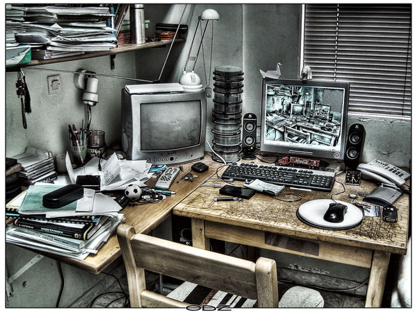
http://alex12m.deviantart.com/art/Room-HDR-77680337?q=boost:popular+hdr&qo=15 “HDR photography example”
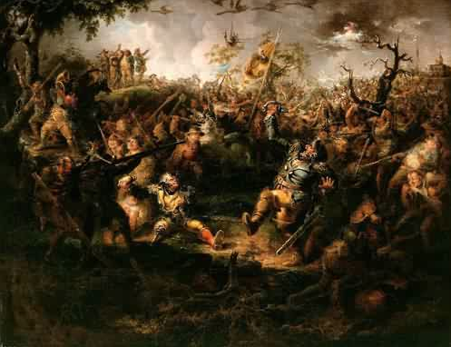
http://www.oceansbridge.com/oil-paintings/product/63321/abattlescenefromknickerbockershistoryofnewyork1838
Done.
Are we done?
What we have proven so far is that raising the contrast in the Canon 5D mark ll makes the dark too dark and the whites too dark. So what?!
Why don’t we try to measure how many camera stops we can fit into a high or low contrast jpg and actually measure the effect the contrast settings have? That would be fun! Yes Timmy, fun.
Let’s look at some more graphed data! Yay!
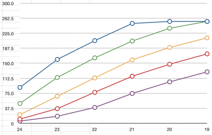
If we photograph out Colour Checker again, and the contrast setting is at the lowest, and we only change the shutter speed one stop at a time, and read the values of the six square grey scale tiles in Photoshop then we get a graph like this.
Blue is 100th of a second, green 200, yellow 400, red 800, and purple is 1/1600th of a second.
Graph 2 proves that each stop in the camera changes the image by about 40 RGB points.
Since each stop in the camera ( shutter goes from 1/800 to 1/400 or aperture goes from f8 to f11)
accounts for about 40 RGB points (240 to 200 for example)
then we can say something about how many stops we can see in one photo.
In other words, how much “dynamic range” we can see from the brights to the darks.
At the high contrast setting we go from about 10 to 250. Thats a range of 240 which is pretty much the whole range possible. 240/40 is 6 stops.
At the lowest setting we go from 20 to 200. Which is a range of 180. 4.5 stops.
But we should not look at the range displayed from the camera image, we have to look at the slope of the response of the different contrast settings and then extrapolate to either end of the range.
We have to ask “how far into the whites and blacks could the camera have seen at a certain setting?”
And then measure how many stops that would be.
To help explain this we have to imagine a camera that we can set to “very very contrasty”.
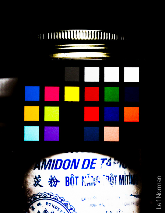
It would make pictures that look like this:
So instead of nearly totally black, dark grey bla bla bla up to white we get black black dark grey white white white.
This would be a dynamic range of only one or two stops.
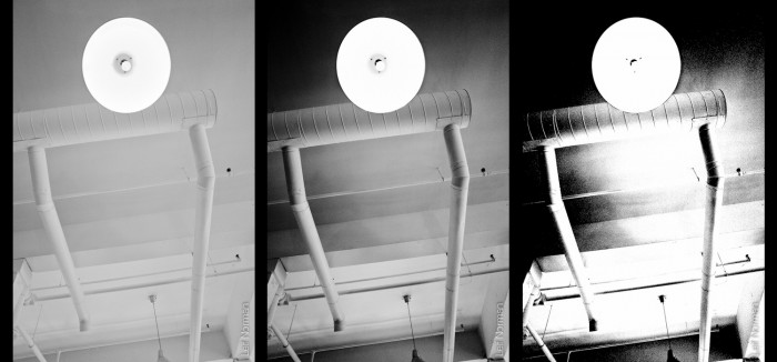
Here is the a photo shown with very low, to high to ridiculously high contrast:
The tonal response jumps from extreme to extreme in the high contrast image. There is very little middle ground. Everything is rendered in 0,0,0 or 255,255,255. If we were to put it on the graph above with the rest it would have a very steep slope in the middle, much steeper than the blue line already there.
So we can say that the slope of the line can tell us about dynamic range.
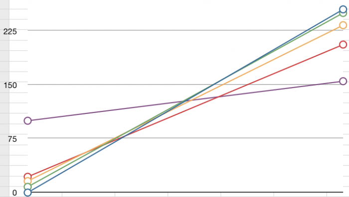
If we imagine another hypothetical camera, one that can only see grey tones, like the black and white image on the left, then the slope of the line would be much more horizontal on the graph below. It would see very dark and produce grey. And it would see very bright and produce lighter grey.
The Y axis (vertical line) is the entire range possible in computer colour land; 0 to 255.
The X axis (horizontal line) is the range given by the strip of six white to black squares on the Colour Checker.
The Green Yellow and Red lines show the actual contrast from the Canon 5D mark ll.
Green is high contrast, yellow is mid and red is low.
The higher contrast setting has a steeper slope and the lower contrast line has a more shallow slope.
Therefore, a steeper slope means the camera is giving you less dynamic range and the shallow slope will indicate more dynamic range.
The Blue and Purple lines are hypothetical responses. The blue line would be a camera that would look at the Colour Checker and display pure RGB black (0,0,0) to pure white (255,255,255).
This would be even higher contrast than the highest contrast setting available on the 5D mark ll.
Using the y=mx+b equation
http://en.wikipedia.org/wiki/Linear_equation
I calculated the slopes of the lines and extrapolated the endpoints of the lines within the 0 to 255 range of the Y axis.
Since we are taking 40 RGB values to be one stop we would say that the Canon 5D mark ll at the highest contrast setting has a dynamic range of 6.7 stops.
At the lowest contrast setting it would be about 8.8 stops of dynamic range.
Green line: Highest Contrast: 6.7 stops
Yellow line: Middle Contrast: 7.5 stops
Red line: Lowest Contrast: 8.8 stops
Purple line: made up low contrast slope: 30 stops.
Ta Da! We actually said something concrete!
Approximately one stop is gained in the dynamic range of the scene as you go from lowest to mid and mid to high.
There. Science! and photography!


